Every PySpark job produces two outputs. One is the result you asked for. The other is a running account of how Spark got there: how it cut your code into jobs, where it moved data, which joins it chose, how long each piece took. That account is served as a web page by your own SparkSession, on by default, at http://localhost:4040. In my experience it is the single highest-leverage thing a new Spark engineer can learn to read, and the thing most people skip.
I am going to walk you through it the way I do for engineers joining my team. Not every tab, just the five screens that answer real questions, what to look at on each, and how to turn what you see into a decision. If you are new to Spark, read it top to bottom. If you have been writing Spark for a year and have never opened the SQL tab, skip to Screen 3, then come back.
You do not need a cluster. Everything below ran on my laptop with
local[*], Spark 3.5.2, and a dataset shaped like the retail_db
tables used in most Spark courses: 60,000 orders, 132,000 order lines,
1,345 products, 40 categories. Start a session, open port 4040 in
another tab, and follow along.
#The vocabulary the UI is organised around
Spark has its own words for units of work, and every screen in the UI is a view over one of them. Get these five straight and the rest of the UI stops looking arbitrary.
- Transformation. A step that describes work but does not perform
it:
filter,join,groupBy,select. Spark records what you asked for and builds a plan. - Action. A step that forces execution and returns something:
show,count,collect,write. Nothing runs until an action is called. - Job. Everything Spark must do to satisfy one action. One action, one job, with a few exceptions I will point out.
- Stage. Spark cuts a job into stages at every point where rows
have to be redistributed across partitions. That redistribution is a
shuffle, and
groupBy,join,orderByanddistinctall cause one. No shuffle, no new stage. - Task. A stage runs as one task per partition. Tasks are the unit of parallelism, and the thing that actually occupies a CPU core.
Keep that hierarchy in mind. The Jobs tab lists jobs, the Stages tab lists stages, and each stage page lists its tasks. When something is slow, you descend that tree until you find the level where the time is.
#The query behind the screenshots
completed = orders.where(F.col("status").isin("COMPLETE", "CLOSED"))

revenue = (items.join(completed, "order_id")
                .join(F.broadcast(products.select("product_id", "category_id")), "product_id")
                .join(F.broadcast(categories.withColumnRenamed("name", "category")), "category_id")
                .groupBy("category")
                .agg(F.round(F.sum("subtotal"), 2).alias("revenue"),
                     F.countDistinct("order_id").alias("orders"))
                .orderBy(F.desc("revenue")))
revenue.show(10)
Revenue per category over completed orders: filter orders, join order
lines to them, attach product and category, aggregate, sort. It is a
deliberately ordinary query, because the point is to show you how much
the UI reveals about ordinary code. I made three choices on purpose so
that specific things would show up on the screens: I wrote the first
join as if both sides were large, I added two manual broadcast()
hints, and I set spark.sql.shuffle.partitions to 8. The same script
also ran a word count with the RDD API and cached a frame at the end,
so those appear too.
#Screen 1 — Jobs: how your code was cut up
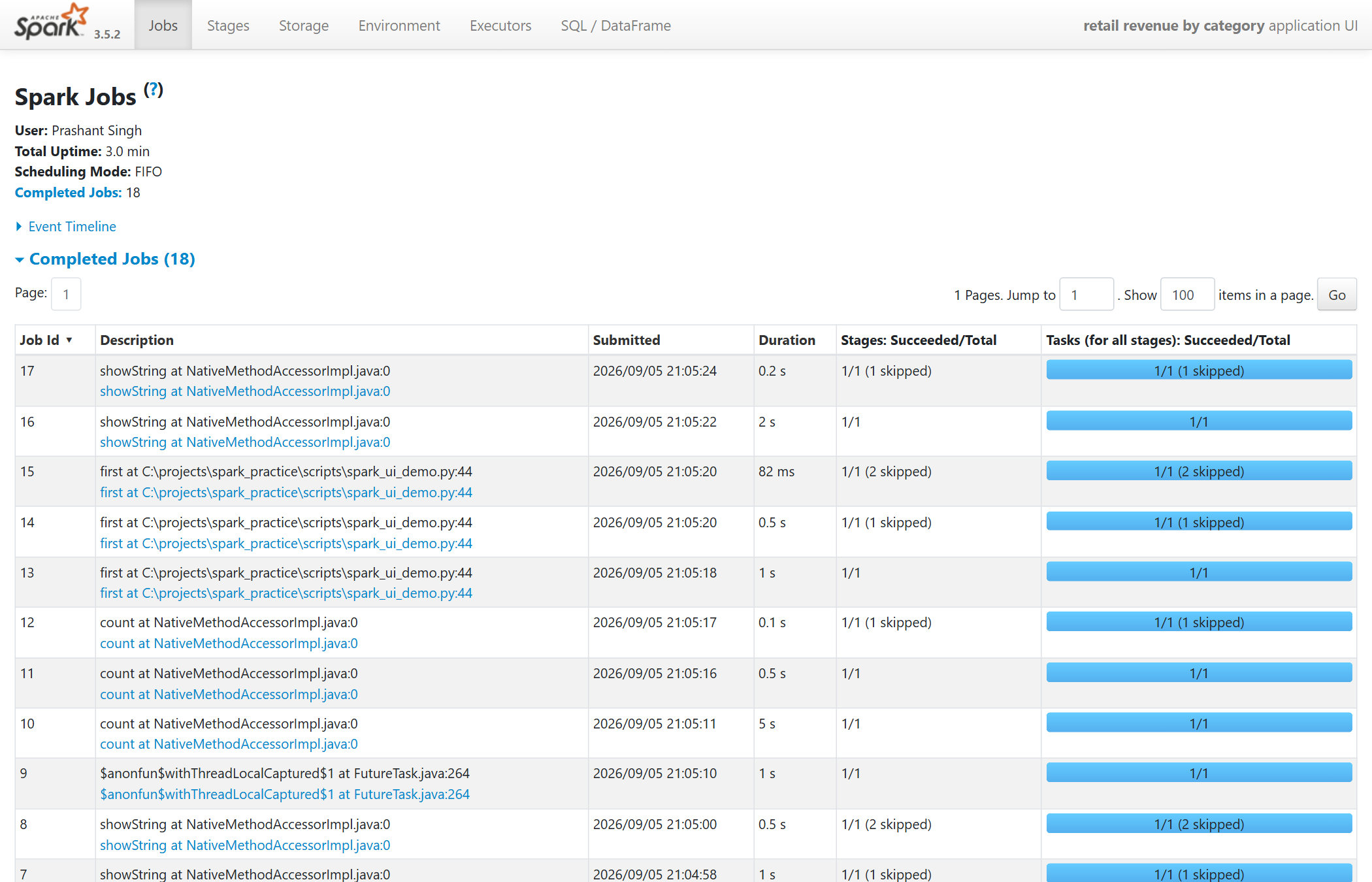
The Jobs tab is the landing page. The header shows the user, session uptime and the count of completed jobs. Below it, one row per job, newest first.
Start with the count. The script has perhaps six lines that do
anything, and the tab shows eighteen jobs. Every show(), count()
and first() is an action, and every action is a job. A show() on a
sorted DataFrame is frequently two or three jobs, because Spark samples
the data first to choose range boundaries for the sort. This is the
first lesson I want you to take from the Jobs tab: the count() calls
people sprinkle through a pipeline "to check" are not free. Each one is
a full job, and in a long pipeline they routinely double the runtime.
The Description column names the action that triggered the job, and links to the job's page. Duration is where you find the expensive ones. Stages: Succeeded/Total and Tasks tell you how much work each job represented.
Now the rows marked 1/1 (1 skipped) or 1/1 (2 skipped). A skipped
stage is good news. It means Spark had already computed that stage's
output for an earlier job and reused the shuffle files it left on
disk instead of recomputing. Nobody asks for this, it is automatic, and
it is why two actions on the same aggregated DataFrame cost much less
than double.
What to check: the number of jobs against the number of actions you intended, the longest duration, and any job with an unexpectedly large task count.
#Screen 2 — the DAG: where the shuffles are
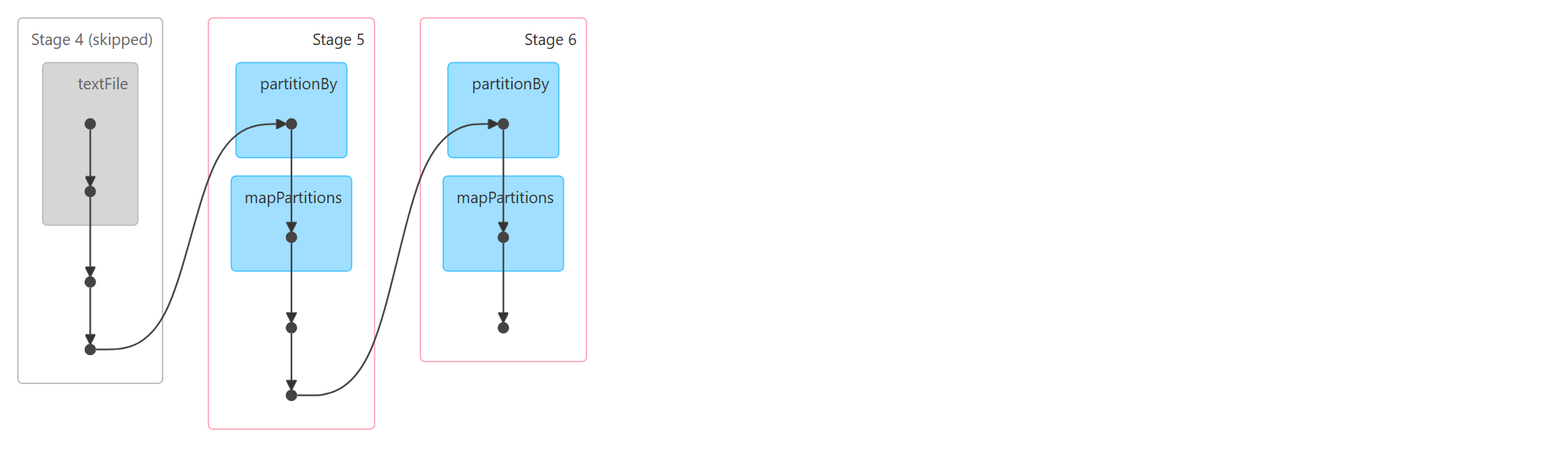
Open a job and expand DAG Visualization. A DAG is a directed acyclic graph: boxes and arrows with no loops. Each large rounded box is a stage, and each arrow between stages is a shuffle. This is the fastest way to see how many times a job moves data.
This DAG is the word count: reduceByKey, then sortBy, then
take(3). Read it left to right.
- Stage 4 is grey and marked skipped. It is the file read and first map. An earlier job already produced this stage's shuffle output, so this job started from Stage 5.
- Stage 5 opens with
partitionBy. That is the RDD API's name for a shuffle.reduceByKeyneeds every occurrence of a word in the same partition before it can sum them. - Stage 6 also opens with
partitionBy. Sorting is a second shuffle: rows have to be routed to the partition that owns their range of the key.
Two shuffles is the correct minimum for count-then-sort. The lesson is not that this job is wrong. It is that the DAG makes the shuffle count visible, and shuffle count is the single best first-order predictor of Spark job cost. Each boundary means every row is serialised, written to local disk, sent across the network and read back. When a job is slow, count the boxes before you look at anything else.
What to check: the number of stages, which are skipped, and whether a shuffle has appeared that your code did not obviously ask for.
#Screen 3 — SQL / DataFrame: what Spark actually decided
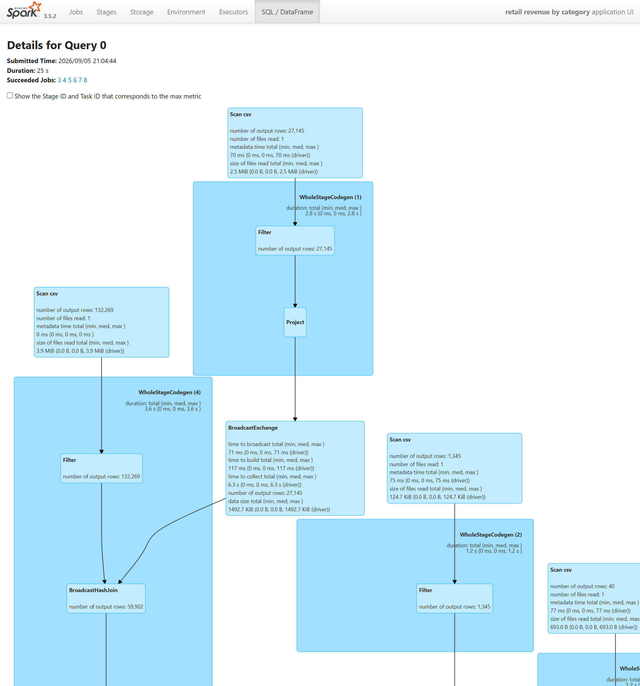
If you write DataFrame or SQL code, this is the most important tab in the UI, and the one I see intermediate engineers neglect most. It lists every query; open one to see its physical plan, the concrete sequence of operators Spark chose. Your code states intent. The plan shows what Spark did about it, and the two are often different. This query is a good example.
Read the graph top down. Each box is an operator and carries its output row count.
- Scan csv boxes are the file reads. The right-hand one is orders: 60,000 rows. The left-hand one is order lines: 132,269 rows.
- Filter under the orders scan kept 27,145 rows. That is the
status in (COMPLETE, CLOSED)predicate. - BroadcastExchange is the box to understand. I wrote
items.join(completed)as a plain join between two tables and gave Spark no hint. Spark estimated the filtered orders side at roughly 1.5 MB, well under the defaultspark.sql.autoBroadcastJoinThresholdof 10 MB, and chose to broadcast it: ship a complete copy to every executor so the large side never has to shuffle. The twobroadcast()hints I wrote by hand were redundant. The broadcast I did not write is the one that shaped the query. That asymmetry is common, and it is why I tell people to read the plan before adding hints, not after. - BroadcastHashJoin is the join itself, producing 59,902 rows.
Row counts are the first thing I read on any plan, because they are a
free correctness test. Had the join produced 132,269 rows, the filter
was not applied. Had it produced far more, the join key was not unique
on one side. You get this at every operator without adding a single
count() to your code.
Then the timings. BroadcastExchange reports time to collect:
6.3 s. To broadcast, the driver has to collect the rows to itself
before distributing them, and that step is single-threaded on one
machine. Six of this query's 25 seconds went there. The
WholeStageCodegen boxes, where the filtering and joining actually
execute, each took under 4 seconds. Anyone who set out to "optimise
the join" here would be optimising the cheap part. The plan tells you
where the time is; your intuition about the code usually does not.
What to check: row counts at each operator against what you expected, which join strategy Spark selected, and which operator holds the largest share of wall time.
#Screen 4 — Stages: tasks, skew, and adaptive execution
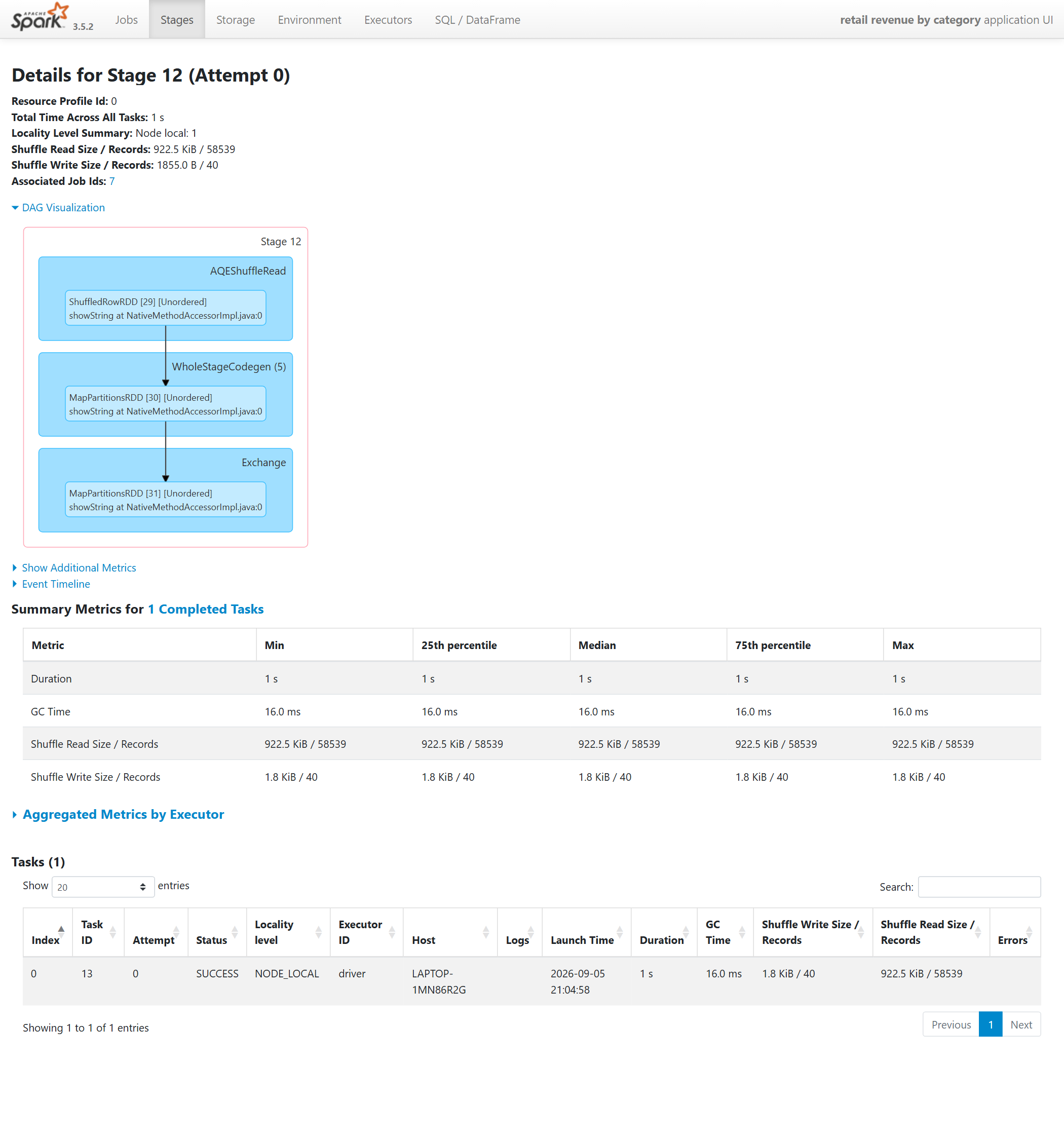
Open any stage and you get this page. Three parts of it matter.
The header gives stage totals: aggregate task time, shuffle bytes read and written. This stage read 922.5 KiB / 58,539 records and wrote 1.8 KiB / 40 records. Forty is the number of categories, so this is the aggregation stage.
Summary Metrics is the table in the middle: min, 25th percentile, median, 75th and max across tasks for duration, GC time, and shuffle read and write. This table is how you diagnose skew, the most common Spark performance problem in production. When the max duration sits far above the median, one partition holds a disproportionate share of the data and one task is doing most of the work while every other core idles. On this page every column is identical, and the reason is the third thing to notice.
The line reads Summary Metrics for 1 Completed Tasks. I set
spark.sql.shuffle.partitions to 8, so a reader who knows that
setting would expect eight tasks. The top box of the stage DAG explains
the discrepancy: AQEShuffleRead. Adaptive Query Execution is on by
default from Spark 3.2. After the shuffle, it looked at the real output
size, judged that 922 KB split eight ways was wasteful, and coalesced
the partitions into one before running the aggregation. That is the
right call for this data. It is also why, when you change
shuffle.partitions and observe no effect, you are not imagining it:
AQE is overriding you, and the stage page is where you confirm it.
What to check: task count against expectation, and the spread between median and max in the summary table. A max more than two or three times the median is skew worth investigating.
#Screen 5 — Storage: what caching actually kept
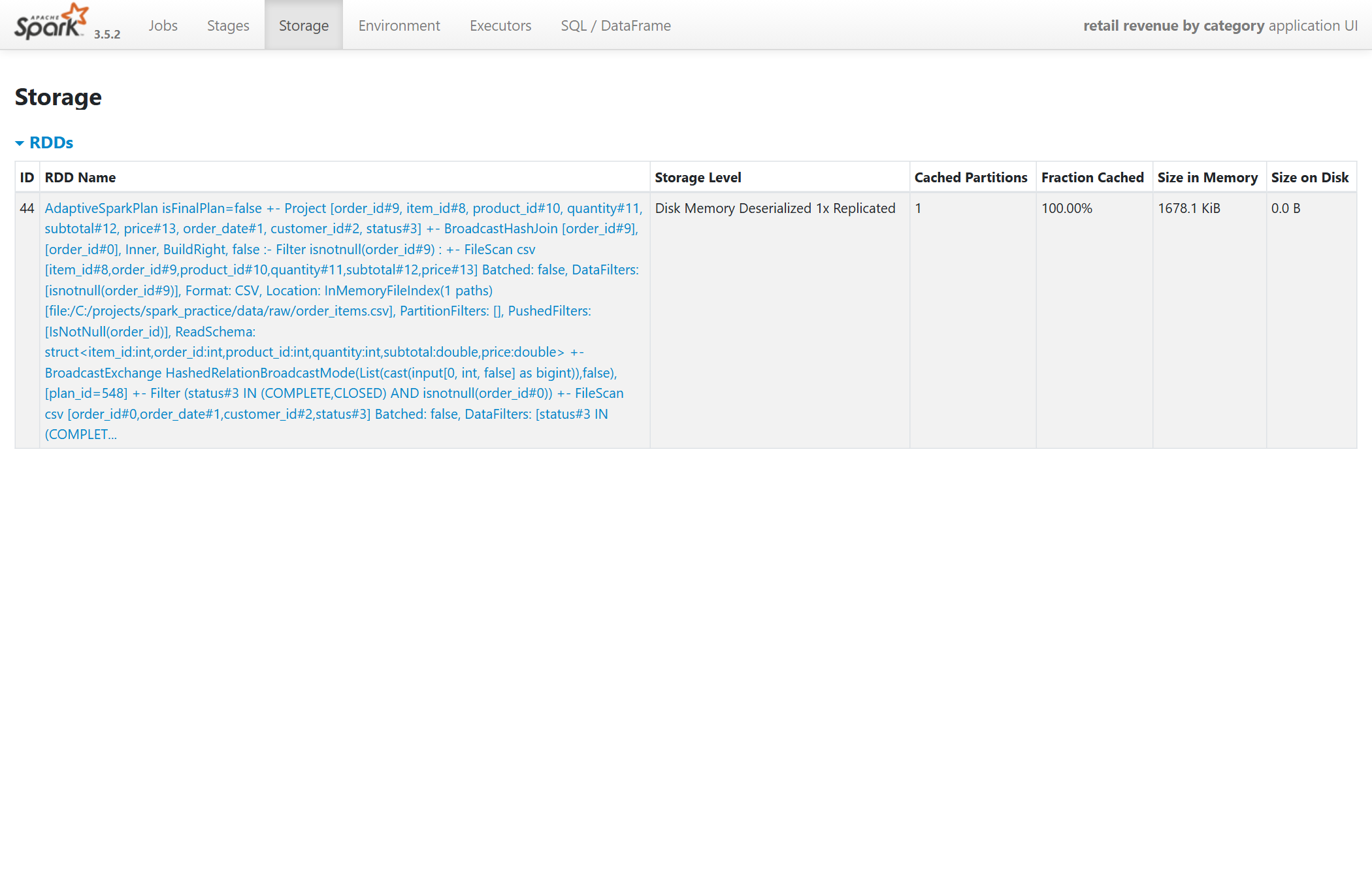
The Storage tab stays empty until you call .cache() or .persist()
on something and then run an action on it. cache() alone does
nothing observable. It is a transformation like any other, and the data
is materialised only when a job computes it.
After the revenue query, the script cached the joined frame and counted it. The tab shows one entry, storage level Disk Memory Deserialized, one cached partition, 100% cached, 1.7 MB in memory.
Three facts this screen makes concrete that people frequently get
wrong. First, cache() on a DataFrame means memory and disk. If the
data does not fit in memory, the remainder spills to disk rather than
being evicted. Second, the partition count is one, because AQE coalesced
the join output. Anything you do next with this cached frame runs as a
single task until a shuffle redistributes it, which is a genuine
performance trap when the cached frame is large. Third, the long text in
the name column is the plan that produced the cached data. When you
have several cached frames, that text is how you map each entry back to
your code.
What to check: whether the thing you cached is present at all (did an action run after the cache call?), its partition count, and whether the cached fraction is 100%.
#The order I check things in
When a job is slow or wrong, this is the sequence. It is deliberately top down, from the cheapest observation to the most detailed.
- Jobs tab. Are there more jobs than actions I intended? Which one is slow?
- SQL tab, row counts. Do the counts at each operator match what the filters and joins should produce? Wrong counts mean a logic bug, and no amount of tuning fixes a logic bug.
- SQL tab, join strategy and timings. Did Spark broadcast what I expected? Which operator owns the time?
- Job DAG. How many shuffles, and is any of them avoidable by reordering or pre-aggregating?
- Stage page for the slow stage. Task count, median versus max, spill. This is where skew lives.
- Storage. Only if I cached something: is it actually cached, and with how many partitions?
Most problems resolve at step 2 or 3. Engineers who go straight to step 5 and start tuning partition counts usually end up tuning around a bug.
#What changes on a real cluster
Everything above transfers directly, with four differences worth knowing before you open the UI on a production job.
The UI dies with the session. It is served by the running
SparkSession. On a laptop, keep the session alive while you read. On a
cluster, enable spark.eventLog.enabled and point a History Server at
the log directory, and the same pages remain available after the job
finishes. If your platform (Databricks, EMR, Dataproc) provides a Spark
UI link on completed jobs, that is the History Server.
Ports increment. Each session on a machine wants 4040; the second
gets 4041, the third 4042. spark.sparkContext.uiWebUrl gives you the
address without guessing.
Local mode has one executor, named driver. The Executors tab will
show a single row for local[*], because the driver executes tasks
itself. On a cluster you see one row per executor, and that tab becomes
useful: it is where you find executors that are being lost, or one
executor with far more GC time than the others.
Absolute timings on a laptop are misleading. JVM and Python worker startup dominate small jobs, particularly on Windows. The 25-second query above would take a few seconds on a modest Linux cluster. What carries over is the shape: row counts, join strategy, shuffle count, and which operator is expensive relative to the others. Read the UI for proportions, not seconds.
#Exercises
These are the exercises I set for people learning this. Each one is designed to make one screen click.
- Run any DataFrame query with a
groupByand ashow(). Count the jobs. Callshow()again and look for a skipped stage. - Open the SQL tab for that query and read the row counts from the scans down to the final operator. Confirm each filter and join did what you intended.
- Join a large frame to a small one and note the join strategy in the
plan. Then set
spark.conf.set("spark.sql.autoBroadcastJoinThreshold", -1)and rerun. You should seeBroadcastHashJoinbecomeSortMergeJoin, an extra shuffle appear in the DAG, and the duration change. - Cache a frame. Open the Storage tab before and after calling
count()on it. - Set
spark.sql.adaptive.enabledtofalse, rerun the aggregation, and compare the task count on the stage page with what you saw under AQE.
#Glossary
- Driver — the process running your Python code. It builds the plan, schedules tasks and, in local mode, runs them too.
- Executor — a worker process that runs tasks. Local mode has one, the driver itself.
- Partition — one slice of a dataset. One task processes one partition.
- Shuffle — redistributing rows across partitions so related rows end up together. Required by groupBy, join, sort, distinct. Marks a stage boundary.
- Broadcast — sending a full copy of a small table to every executor so a join can avoid shuffling the large table.
- Physical plan — the concrete operators Spark chose to execute your query. Shown in the SQL tab.
- AQE (Adaptive Query Execution) — Spark re-planning parts of a query at runtime using observed sizes: coalescing small shuffle partitions, switching join strategies, splitting skewed partitions.
- Skew — a few partitions holding far more data than the rest, so a few tasks run much longer. Visible as max far above median on the stage page.
- Spill — data a task could not hold in memory and wrote to disk mid-stage. Reported per task on the stage page; frequent spill means partitions are too large or executor memory too small.